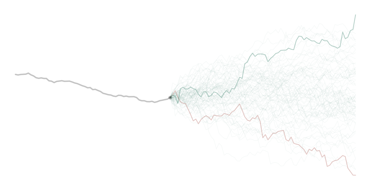

The Nifty 50 TRI has returned 6.6% a year over the last five years, dividends included. Since 1999, only about one five-year stretch in ten has been this weak.
Stretches like this bring back an old idea: a bad five years sets up a good five. It’s worth checking against the data.
Does a bad five years really set up a good five?
This is the chart that usually gets shared.
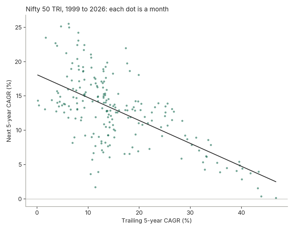
Every dot is a month. Left to right is how the previous five years went. Bottom to top is how the next five went. The weak stretches on the left were mostly followed by strong ones.
Now look at these.
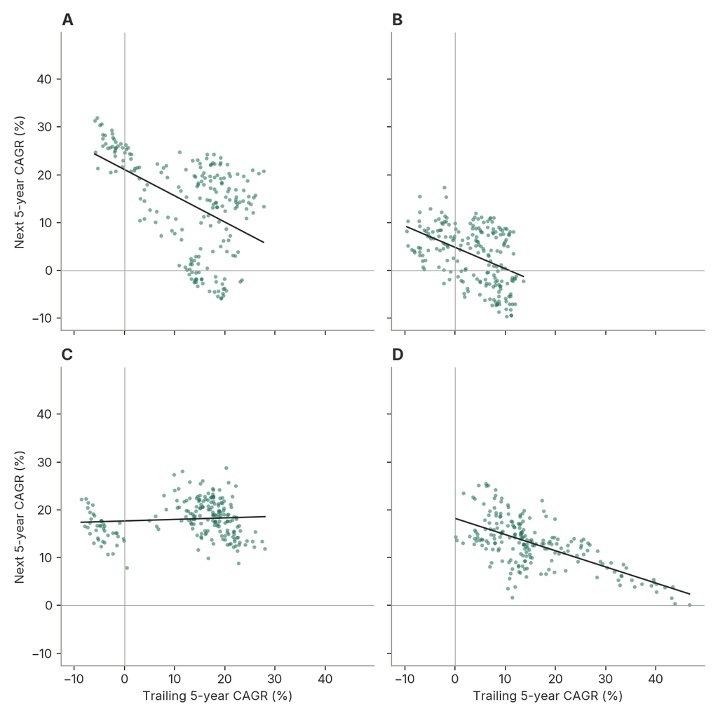
Only one is the Nifty (it’s D). The other three are fake. I built them from the Nifty’s own monthly returns. Picture all 327 months on slips in a bowl. Draw one, note it, put it back, and draw again, 327 times. A bad draw doesn’t make a good one more likely next. So in these markets, a bad stretch can’t affect what comes next.
Two of the three fake ones still slope down. Overall, I made 5000 of these fake histories. Five out of six slope down, and half slope at least as steeply as the Nifty. The Nifty’s dots do sit closer to its line than most; about one fake history in eight is as tight.
Why would a random market slope down?
Because “weak” and “strong” are measured against the average, and in a short record the average comes from the same few stretches.
Say a market has only three five-year stretches, returning 6%, 16% and 20% a year. The average is 14%. The first stretch is 8 points below it; the other two are 2 and 6 points above. Those gaps always add up to zero, because the average was worked out from these three numbers.
So whenever one stretch is below average, the rest have to be above it. If the weak one comes first, it looks like a rebound followed. Nothing caused it. Each stretch could have been pure luck.
With only a handful of stretches, this tilts the chart downward most of the time. With hundreds, the effect fades.
So the slope on its own can’t prove the Nifty has a memory, with mean reverting characteristics. Markets with no memory create the same slope too.
What actually happened after weak stretches?
A more direct test. Take every month when the Nifty’s trailing five-year CAGR was below 8%, and look at the next five years.
They returned 16.2% a year on average. The Nifty 50 TRI’s long-run return is 13.0%.
That looks like a rebound. But those months come from just three or four weak spells. The real question is what a market with no memory would show on the same test.
What does a market with no memory show?
I ran the same test on the 5000 fake histories.
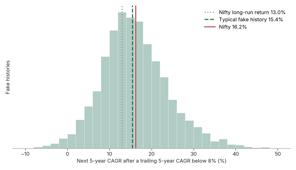
Even in markets with no memory, this test gives about 15.4%, well above their true 13%. So the Nifty’s 16.2% is no evidence of a rebound. It sits near the middle, with 46% of the fake histories showing a bigger one. Moving the cut-off anywhere from 5% to 10% gives the same answer.
The spread is wide too. Half the fake histories are between 11% and 21% a year. That range is realistic. The Nifty’s own five-year returns have run from almost nothing (0.2% a year from October 2007) to 47% a year (from October 2002).
Don’t averages have to even out?
They do, by dilution.
Take a market that usually returns 13% a year. Say it returns nothing for five years, then a plain 13% every year after.
| Years since the start | CAGR |
|---|---|
| 5 | 0% |
| 10 | 6.3% |
| 15 | 8.5% |
| 20 | 9.6% |
| 25 | 10.3% |
The average keeps climbing, but slowly. Even after 25 years it’s at 10.3%, and no single year ever beat 13%. The lost five years never come back. They just matter less as time passes.
What about three year periods?
Here the picture is less tidy. After three-year stretches below 5% a year, the Nifty returned 24.5% a year over the next three. The typical fake history shows 15.0%, and only 13% of them match the Nifty.
Most of that gap comes from a single stretch. The Nifty fell sharply between 2000 and 2003, and its P/E dropped from 28.5 to 10.8. The boom that followed delivered three-year returns of more than 40% a year. If the test starts in 2004 and leaves that stretch out, the Nifty’s three-year result is in line with the fake histories. The five-year test doesn’t include it at all, since its first reading is in 2004.
At both horizons, the Nifty leans a little towards rebounds. Neither lean is large enough to tell apart from luck.
So where do returns come from?
A market’s return has three parts: earnings growth, the change in the P/E (what investors pay for each rupee of earnings), and dividends.
Since 1999 the Nifty 50 TRI has returned 13.0% a year. Most of that came from earnings growth. Very little came from a higher P/E. Over the long run, earnings did most of the work. So when five years are weak, the question is which part failed: the earnings, or the price paid for them.
However, crashes look different.
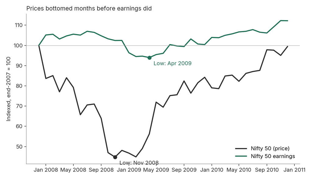
In 2008 the index fell about 55% from its end-2007 level by November. Earnings barely moved at first. They peaked in mid-2008 and fell about 12% to their low in April 2009, months after prices had bottomed. The market priced in the drop before companies reported it.
2011 was similar. The Nifty lost almost a quarter of its value while earnings grew about 10% that year, and again the next.
What made the last five years weak?
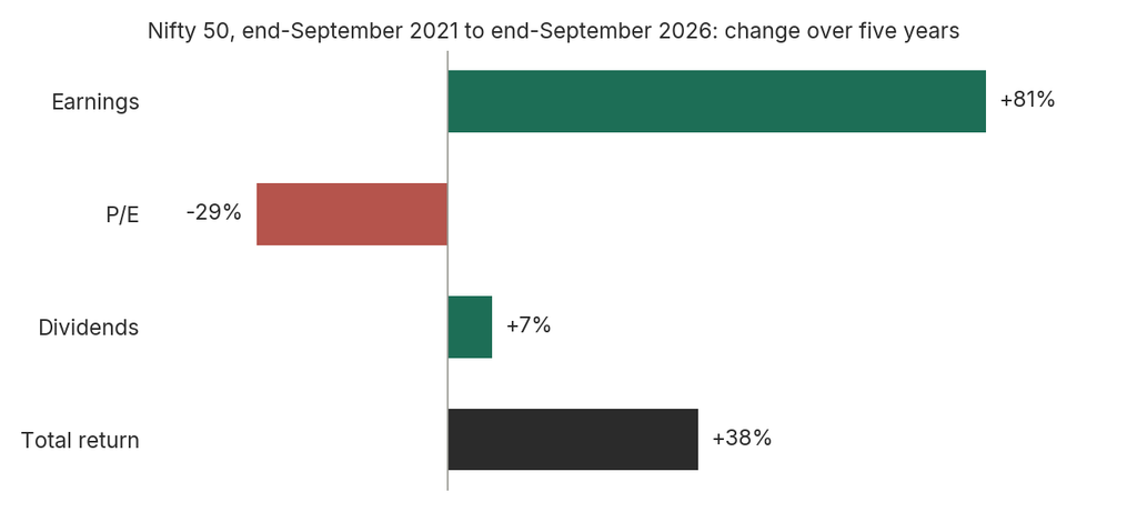
Earnings rose 81%. The index returned 38%, dividends included.
The gap is the P/E. Five years ago investors paid about 27 times earnings. Today they pay about 19, a 29% drop.
Earnings grew about 12.5% a year, faster than their long-run pace of about 10%. This isn’t just a bounce back from Covid either. Measured from the end of 2019, before the crash, growth was about 13% a year.
₹10 lakh invested in September 2021 is worth about ₹13.8 lakh today. Had investors still paid 27 times earnings, it would be worth about ₹19.3 lakh.
So what does a weak five years tell you?
In a market with no memory, losses don’t come back. Five flat years leave you about 46% behind where normal returns would have put you, and every later year grows from that smaller base. The Nifty’s record fits this.
A weak stretch can matter in one way. It can leave the market cheaper. If returns were weak because the P/E fell while earnings held up, the next investor buys the same earnings for less.
The logic may well hold. India’s record just has too few cases to test it. Since 1999, the P/E has fallen 30% or more over three years while earnings rose only twice: in 2002–03 and in 2013. The stretch since 2021 is a third.
Who was buying?
The P/E is the price buyers and sellers agree on. Over these five years, the two biggest groups pulled in opposite directions.
Domestic savers kept buying. Monthly SIP inflows went from ₹12,693 crore in August 2022 to a record ₹32,297 crore in August 2026. Foreign investors sold. They took out about ₹1.66 lakh crore in 2025 and more than ₹2 lakh crore in the first five months of 2026. Their share of Indian stocks is at a 14-year low.
Record domestic buying didn’t stop the P/E falling. Flows tell you who was on each side of the fall. They don’t tell you which way the P/E goes next.
To sum up:
- The rebound chart shows up in fake markets that can’t rebound. On its own, it proves nothing.
- After weak five-year stretches, the Nifty did about as well as a market with no memory. Almost half the fake histories did better.
- Averages recover by dilution. Lost years don’t come back; they just matter less over time.
- Over the long run, returns came from earnings. Crashes came from the P/E, often before earnings fell.
- The last five years were weak because the P/E fell from 27 to 19, while earnings rose 81%.
- Record SIP inflows didn’t stop the P/E falling while foreign investors sold. Flows explain who traded, not what comes next.
- What happens next depends on earnings and the P/E. The past five-year return tells you neither.
Notes on method:
- Data: Nifty 50 TRI, June 1999 to September 2026, converted to month-end values. Nifty 50 P/E and dividend yield are monthly.
- Fake histories: 327 monthly returns drawn at random, with replacement, from the Nifty’s actual monthly returns. Shuffling the real months, or keeping 6- or 12-month blocks together, gives the same results.
- Weak stretch: a fixed cut-off (8% for five years, 5% for three), so nothing is judged with hindsight.
- Five-year test: 5,000 runs. 153 never dipped below 8% and are excluded; 15.4% is the median of the rest. Longer-history figures are averages of 2,000 runs at each length.
- Earnings: index price divided by P/E, with price taken as the TRI minus dividends. Earnings growth also reflects changes in which companies are in the index.
- Accounting switch: NSE moved from standalone to consolidated earnings on 31 March 2021. The P/E fell from 40.4 to 33.2 that day. Earlier P/E values are scaled down to match. The five-year figures fall entirely after the switch.