Ratio charts have become a staple tool for traders seeking to time markets. The logic seems elegant: when gold becomes “expensive” relative to silver, or when stocks become “undervalued” compared to gold, the ratio must eventually revert to its mean. But this reasoning contains a fundamental flaw that has cost countless investors dearly.
The Allure of Ratio Analysis
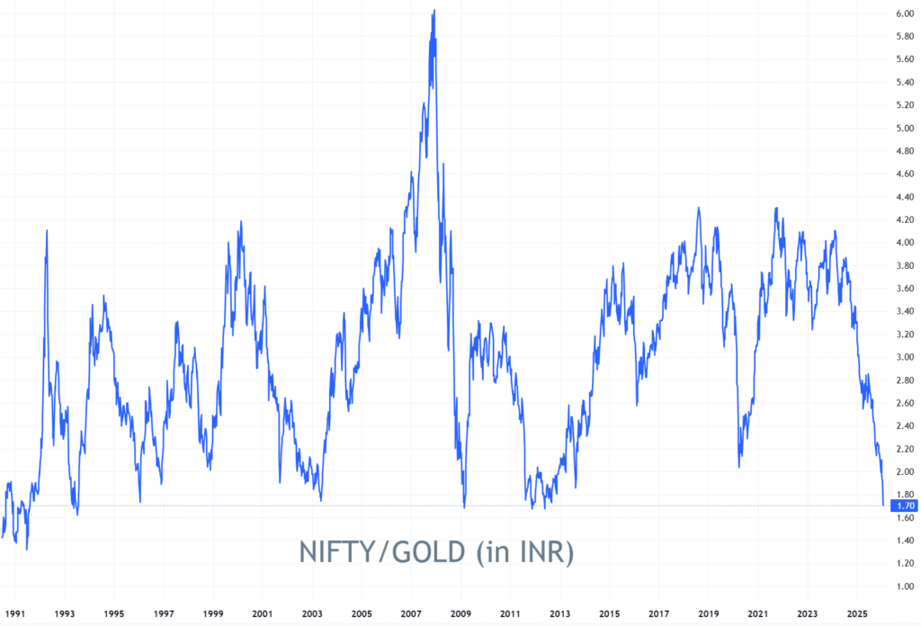
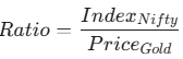
As of January 2026, the Nifty : Gold ratio is testing the 1.7x level. Historically, whenever this ratio has dipped below 1.7x, such as during the 2008 financial crisis or the 2012 policy paralysis, it has preceded a massive bull run in equities. This carries an air of mathematical certainty.
The appeal is psychological. Ratio charts offer what appears to be a way to profit from relative mispricing without taking a purely directional bet. When the ratio reaches historical extremes, it feels like “picking up free money” because “mean reversion is inevitable.”
1. The Asymmetry Problem
The critical issue most ratio traders miss is that markets trend, and trends can persist far longer than ratios can remain “extended.”
Consider the math:
If gold enters a multi-year structural bull market (driven by 2026’s geopolitical tensions and currency volatility) while equities face a “time correction,” the ratio can stay “depressed” for years. Your profit is capped by the distance to the mean, but your loss is technically unbounded if the trend accelerates. You are effectively fighting a trend with a tool designed for range-bound markets.
2. The Directionality Dilemma
Even if the ratio is “due” to revert, the chart cannot tell you how it will happen. If the Nifty:Gold ratio is at a 12-year low, it can “normalize” in several ways:
- Equities Rally: Nifty jumps 20% while Gold stays flat. (The ideal scenario).
- Gold Crashes: Equities stay flat while Gold drops 20%. (The ratio “works,” but your equity portfolio gains nothing).
- Both Fall: Both crash, but Gold crashes faster. (The ratio “works,” but you lose money on your stocks).
The financial outcome of these scenarios is dramatically different, yet the ratio chart looks identical in all three.
Financial markets exhibit persistent trending behavior. When a genuine shift in fundamentals occurs
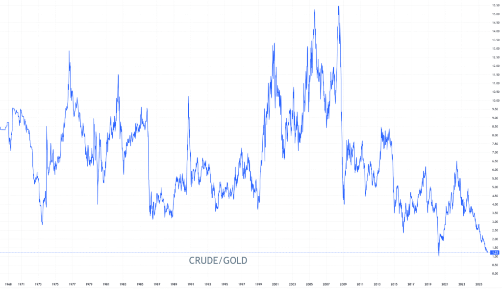
- The Crude-to-Gold Ratio: It always used to mean revert from ~3.5 for half a century. But after 2014 shale fracking discovery and energy transitions, it never returned to its previous levels.
- The “New Normal”: What we call an “extreme” today might simply be the start of a new structural regime where gold holds a higher premium relative to financial assets than it did in the previous decade.
4. The Prediction Paradox
Predicting a reversal is inherently harder than riding a trend. Bull markets “climb a wall of worry,” while reversals are often violent and swift. Ratio trading requires you to be right about two distinct asset classes simultaneously.
When you buy an asset in an uptrend, time is your ally. When you bet on ratio reversion, time is your enemy; every day the ratio doesn’t snap back costs you in opportunity cost and “theta” of the trade.
A Better Approach
Rather than using ratios as trading signals, consider them as contextual clues. A stretched ratio might tell you about extreme sentiment, but it shouldn’t dictate your entry.
- Trade individual assets based on their own price action and fundamentals.
- Use ratios to understand relationships, not to predict “due” corrections.
- Accept that “cheap” can get cheaper. If Nifty is at 1.7x Gold, it doesn’t mean it can’t go to 1.5x.
The markets don’t care about what seems “due” for a correction. They care about supply, demand, and capital flows. Until traders internalize this, ratio charts will remain a graveyard for capital, dressed up in the appealing clothes of mathematical sophistication.